
Christmas 2014
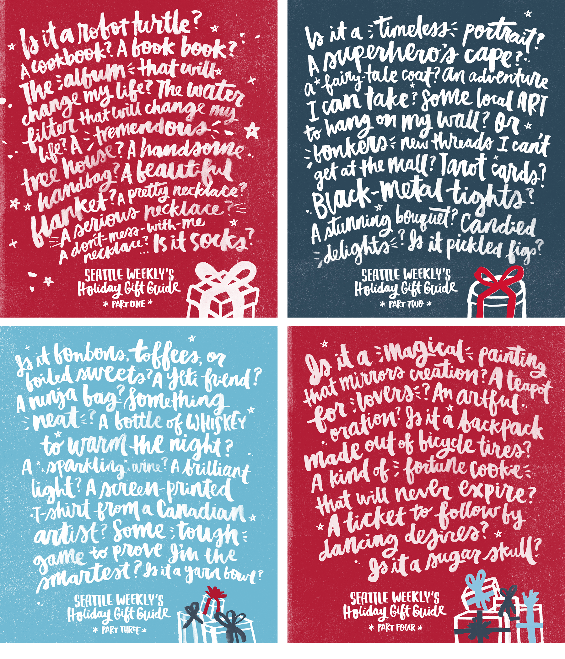
I had the honor of working with a friend of mine, Samantha Wagner, who at the time was Art Director at Seattle Weekly, on a couple of lettering pieces for the 2014 Gift Guide series. For this series, her editors came up with long bits of text that they wanted lettered behind color backgrounds. The text was pretty hilarious, and I had a blast writing it out and working with them!
_
___
INITIAL SKETCHES + SCANS
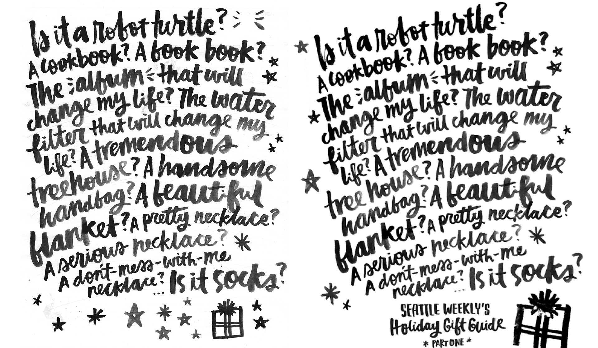
I used a water brush and basic black watercolor pans to do the lettering. I scanned them in high res so as not to need to vectorize them — I didn't want to lose the watercolor effect and texture that made it so fun. It's super rare for lettering lockups to come out perfect at first try, especially when you're going for a more organic look. The scan on the left was my original lockup, and on the left, was tweaked and Photoshopped — I changed and distorted some words, even separated one, added more stars and sparkles around, and added a title. Magic!
_
_
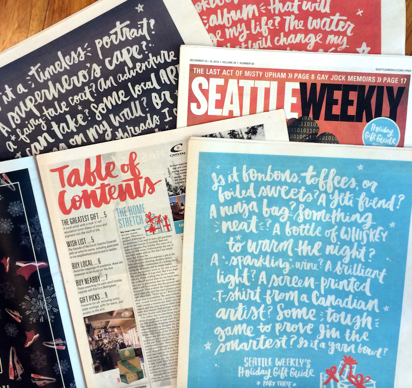
FINAL COVERS
The four covers ran in four consecutive issues (super cool!) I also got to letter out the titles for the sections inside. SO FUN. I absolutely love seeing my work in print — publishing is always going to be my favorite. <3
_